Since I’ve been in the interior design industry, I’ve put extra effort into not being a “snobby” designer. Anyone know what I’m talking about?? I’ve felt that sense of “hoity-toity” in furniture stores before, and nothing makes me not want to be somewhere more! We all have our own styles, tastes, and preferences for design, and far be it from me to tell anyone how their home, that they pay for, should look!! But of course, included in my job description is to help people make their spaces more beautiful, more functional, better designed. The two areas I am a bit more insistent about are light fixtures, and colour stories. Today, I’m talking colour – light fixtures will take up an entire blog themselves, and I need to put extra work into not being snobby LOL! Let’s just say that matching light fixtures from one collection throughout an entire house makes my skin crawl. Moving on…..
It’s pretty common when decorating your home to pick an accent colour and start willy-nilly buying everything you see with that shade in it – pillows, blankets, vases and artwork, even accent chairs – it’s like you suddenly start seeing that colour everywhere and it’s just THE perfect piece for your space! There should probably be a support group for this – “Homesense Anonymous”! Who am I kidding, wouldn’t we all just meet at Winners/Homesense and help each other look for accessories?
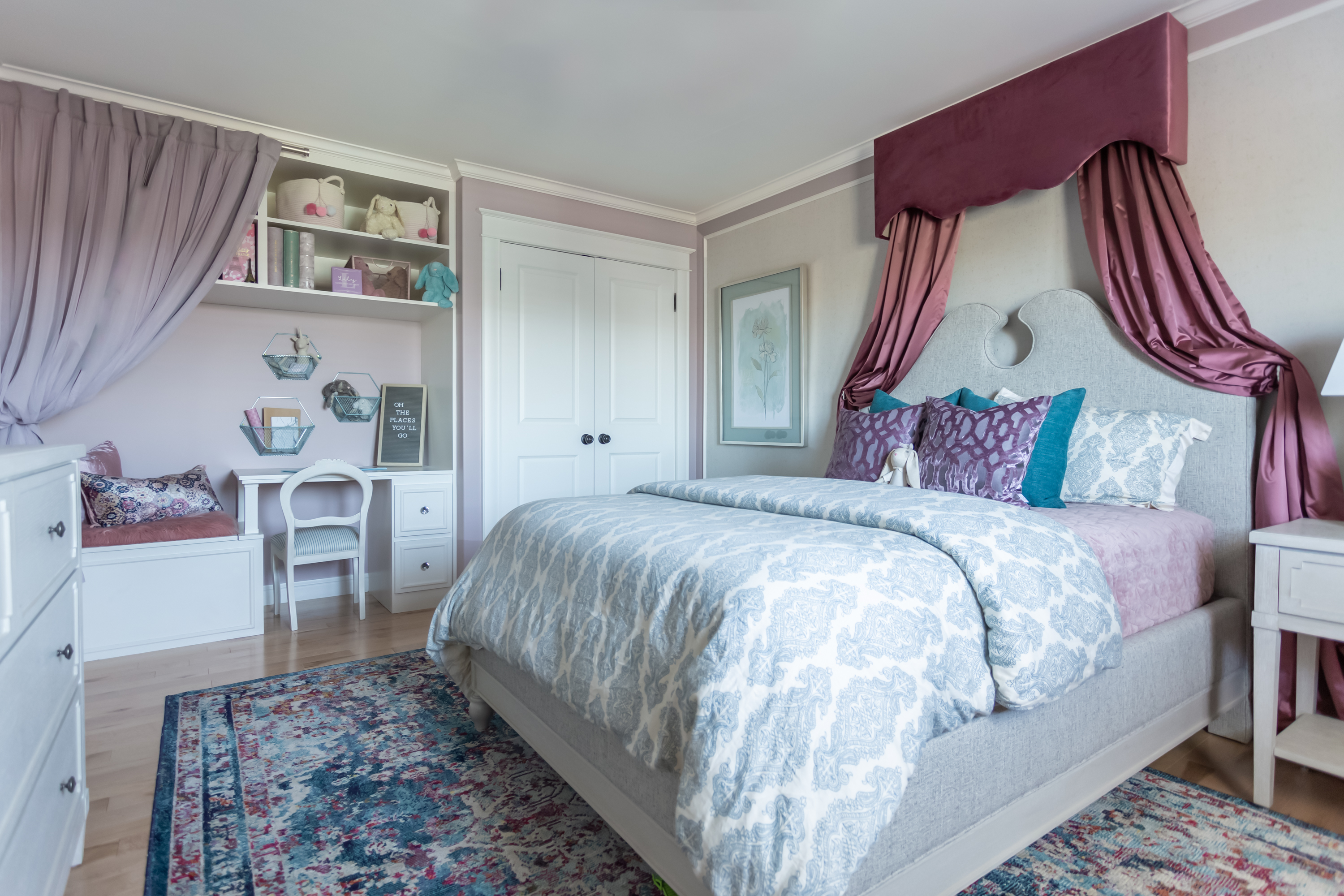
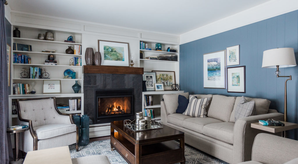
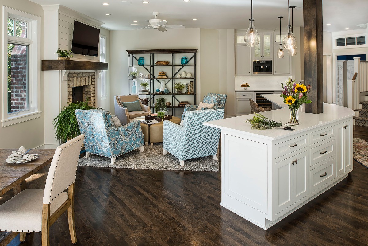
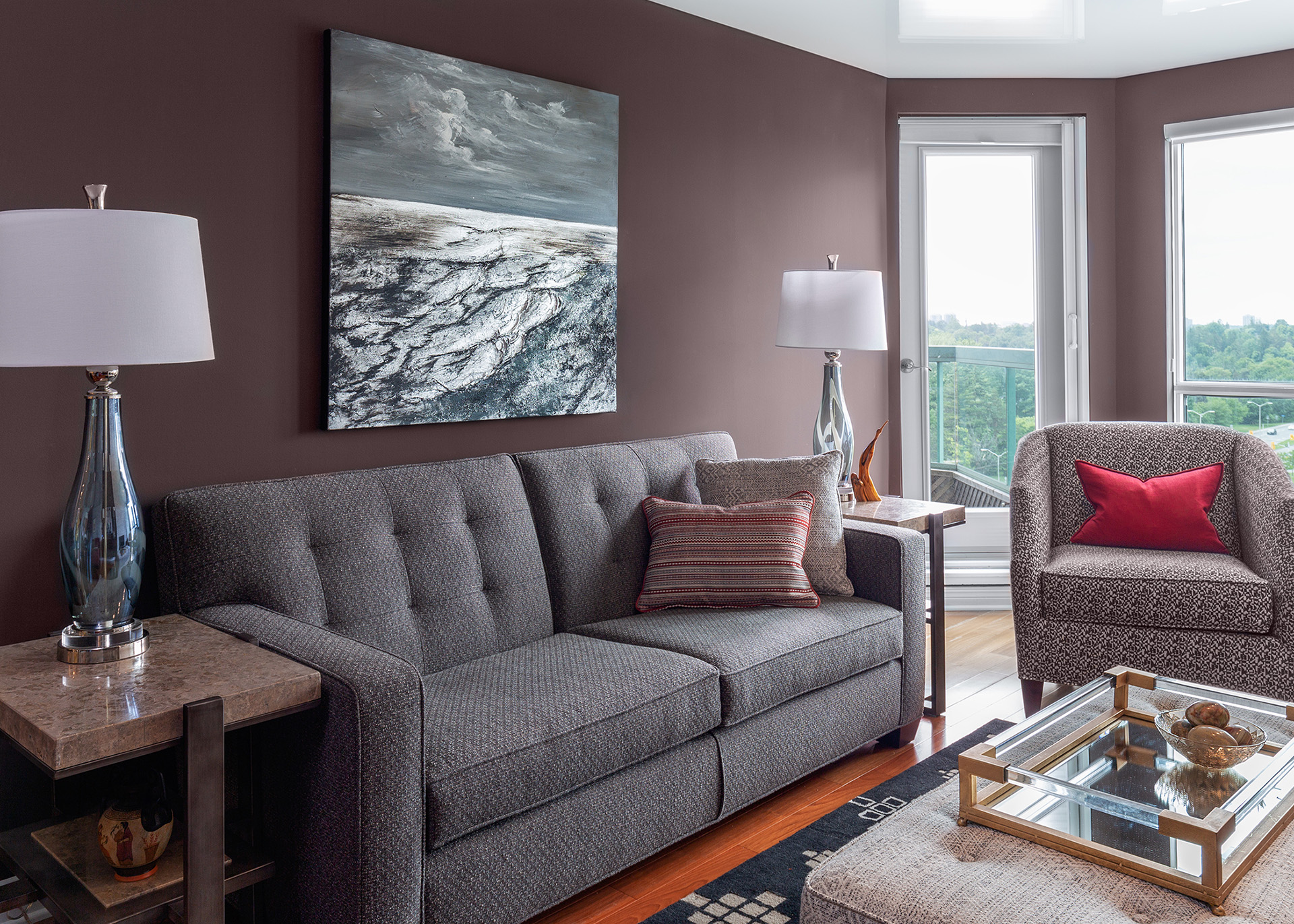
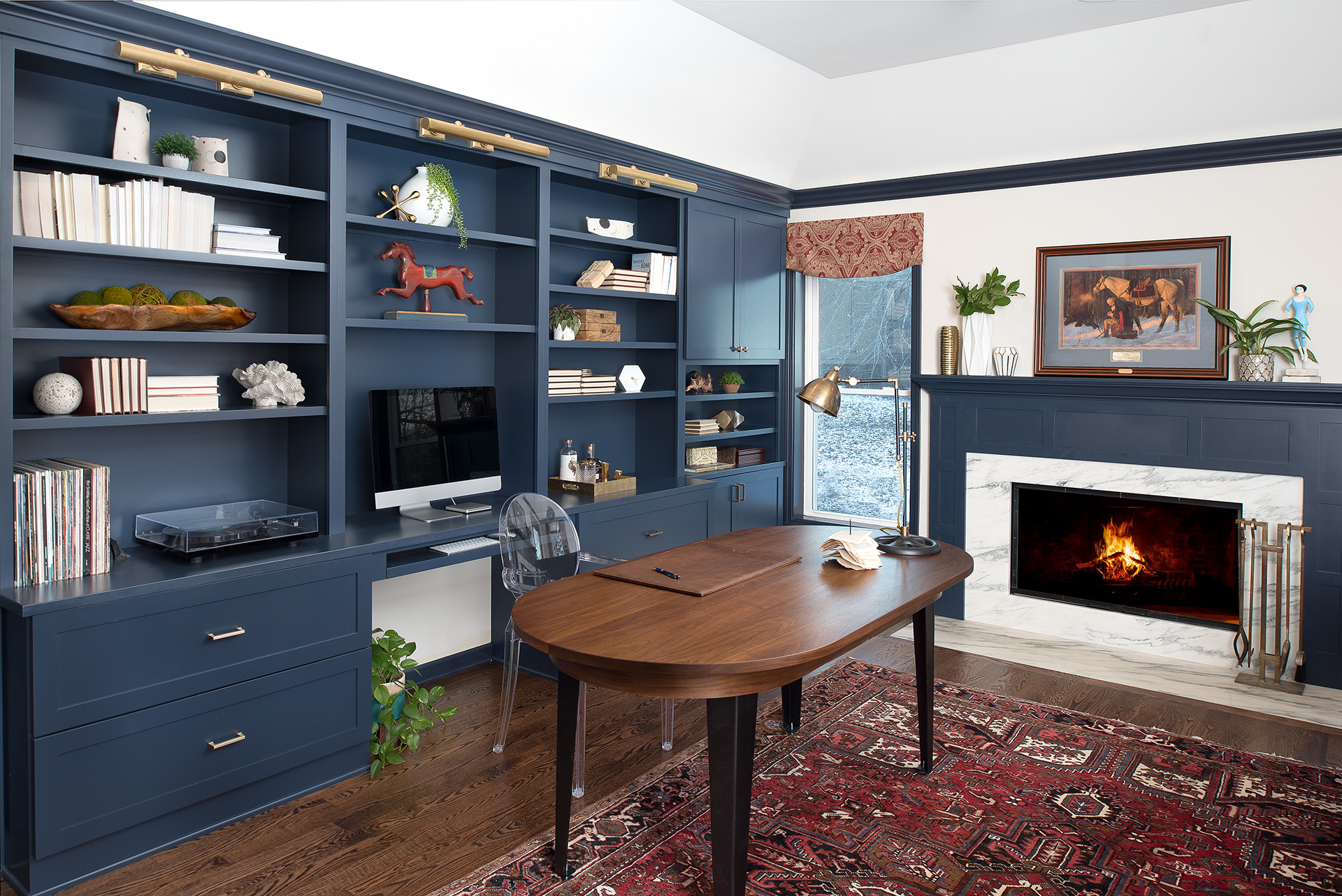
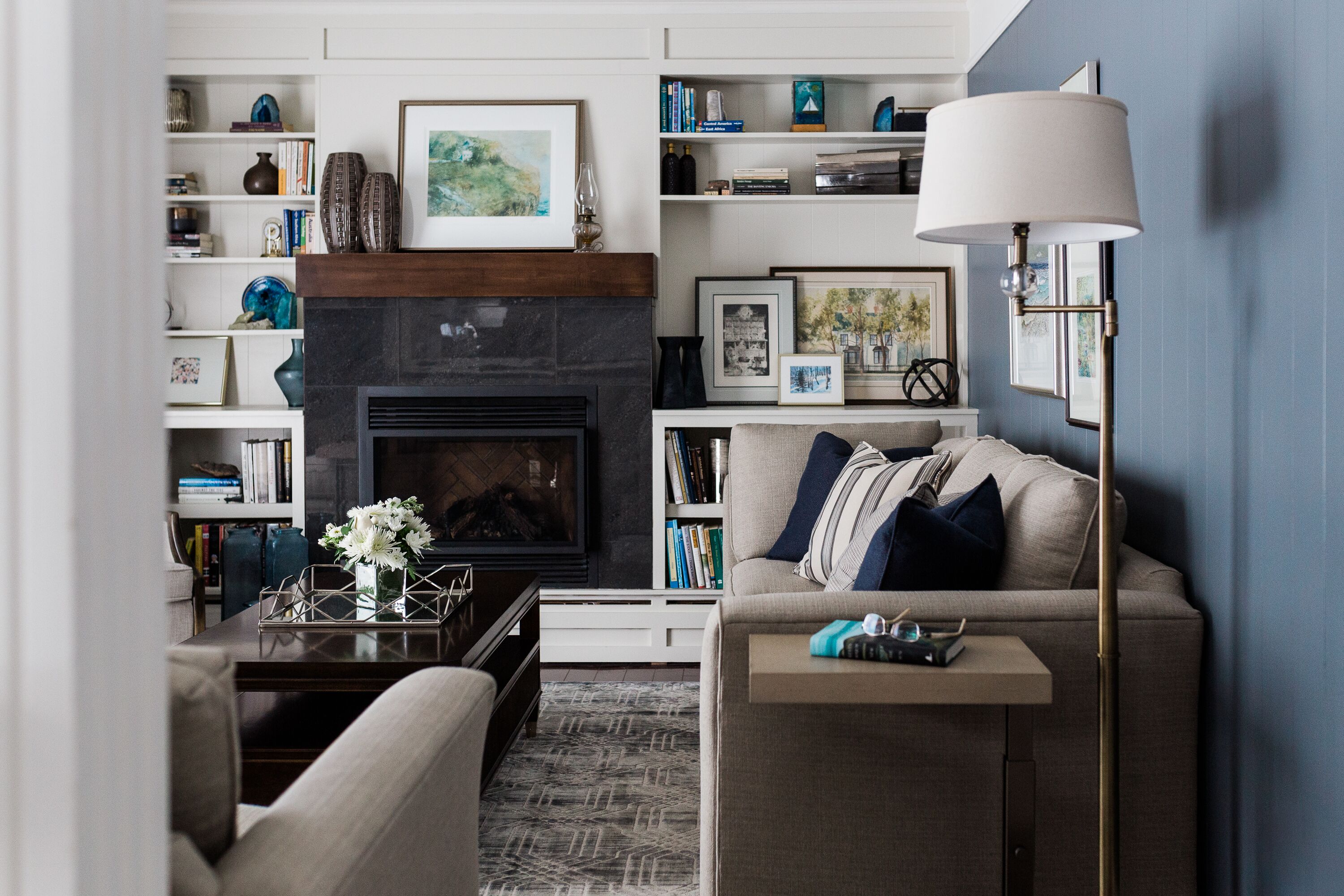
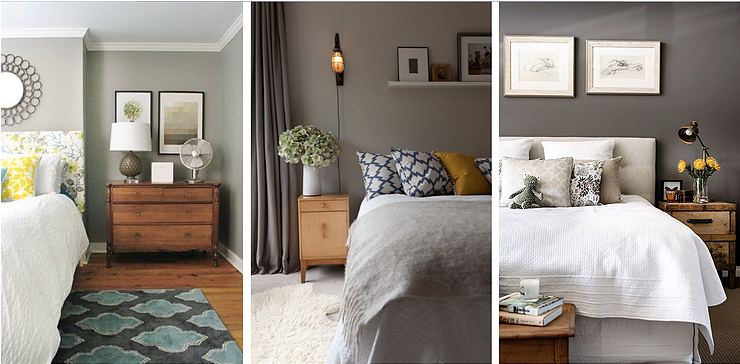
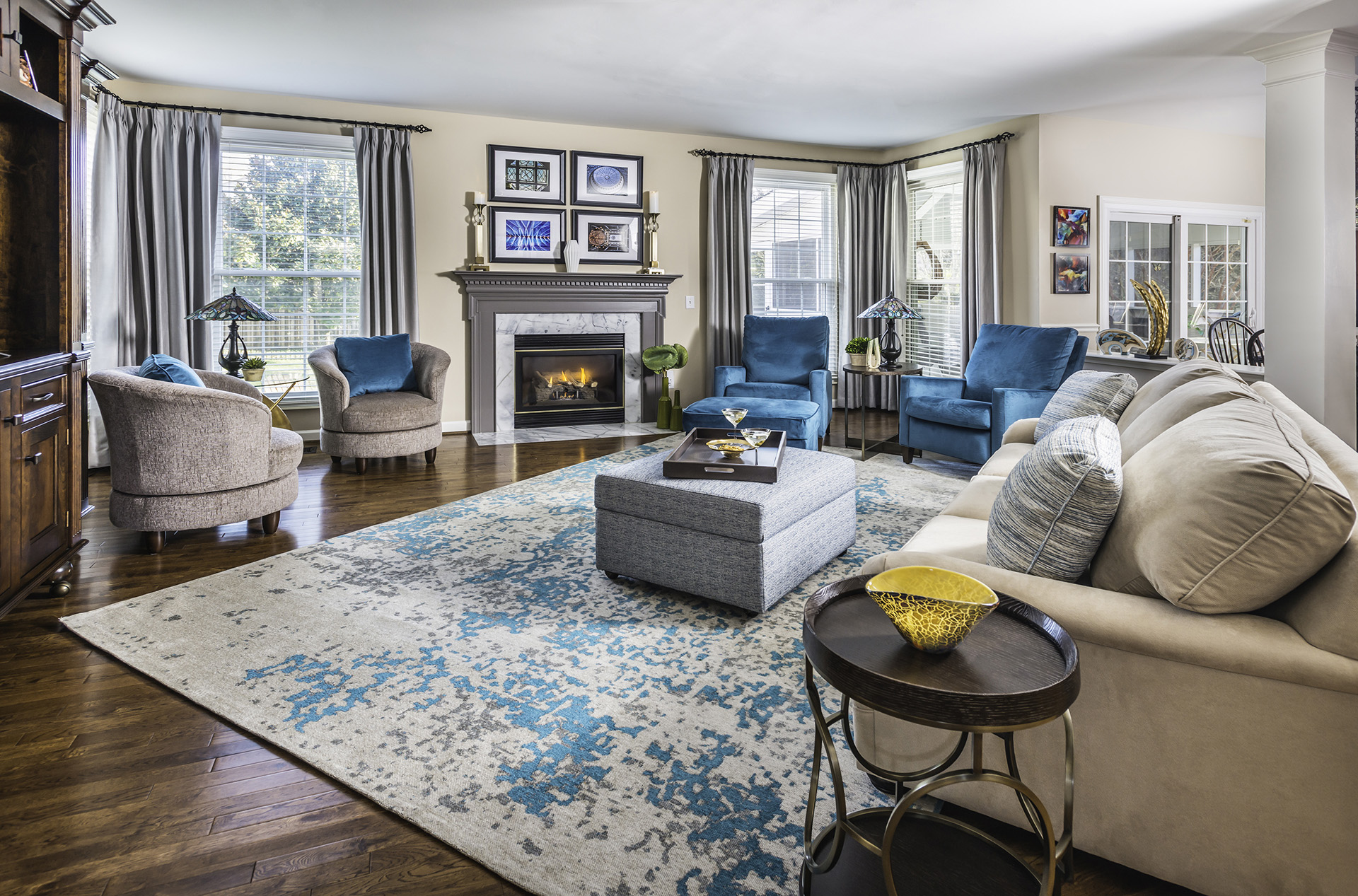
You are nearing the right path when it comes to thinking about adding accents through colour, but to truly create a sophisticated, well-designed and appearing naturally-curated space, you want to mix it up. Enter the 60:30:10 rule; roughly 60% of the space should be one colour, 30% another, and the final 10% another again. This isn’t a hard and fast rule (then again, I say that about all rules), but it does go a long way to helping you bring a space together – and not end up with it looking like a Homesense display!
Neutral colours are the easiest to use for the 60% portion. This can encompass your upholstery, the walls, and any wooden/stained pieces. The 30% should be that main accent colour that first made you rush out to the stores in the first place. Pull this into accent chairs, rugs, throw pillows, and accessories. For the last 10%, you want this colour to work (obviously) with your first accent colour. Complementary colours – think purple and yellow, or red and blue – bring extra contrast and vibrancy to the space. Analogous colours – think greens and blues, or purples and reds – create a quieter, more sophisticated palette.
Am I sounding snobby yet? Whoops, if I am! Try it out in your space though – I swear it works!